

Seattle is getting richer. New money, old news. And lately it’s been good news for a lot of Seattle families. From 2010 through 2014, the number of families earning $200,000 or more went up by 31 percent. But at the same time, the number of families with an income of less than $10,000 grew by 20 percent. And you can see from the chart below that the number of families earning incomes in the middle were depleted.
Areas close to the city center and close to the water saw the largest increases in median family incomes. This shows up on the map as a hot zone that stretches from Seattle’s downtown piers all the way to Lake Washington. But if you look closely, you’ll find that some of the areas farther away from the center, and farther away from the water got a little bit poorer.
In one part of Leschi, the median family income fell $81,157 to $79,500 from 2010 to 2014. But the news isn’t that bad. Up in Laurelhurst, the median family income dropped almost $50,000 in five years to $196,600, which is hard to complain about.
“Seattle has created high-income jobs at an enviable pace, fed by a voracious tech economy,” said Redfin chief economist Nela Richardson. “Seattle is not the first U.S. city to confront income inequality, but rarely does a city’s economic climate shift so quickly. The growing divide between the haves and have nots is changing the complexion of the city by pushing the working class to the periphery. Seattle’s challenge in the midst of all the great income growth happening here is to create an inclusive economic expansion where people can afford to live where the jobs are.”
When you look at the neighborhoods with the biggest increases and decreases in family incomes, you may notice that something seems a little off. Capitol Hill makes both lists. This is possible because within this neighborhood one cluster of Capitol Hill blocks got richer while another got poorer. Income change, just like income distribution, is unequal – sometimes even in the same Seattle neighborhood.
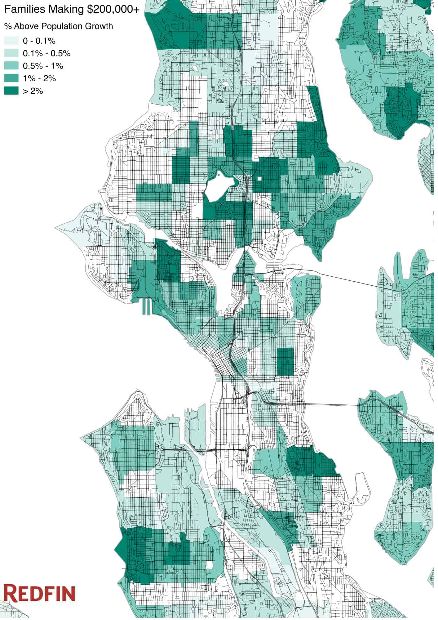
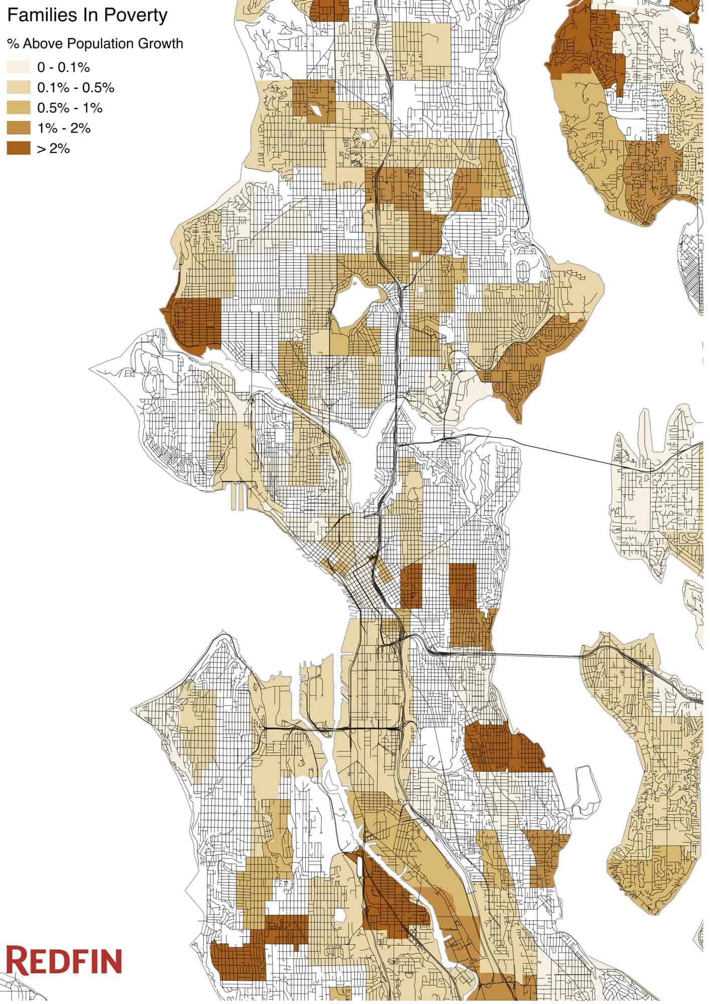
While looking at changes in median family income is just one way to get a sense of what Seattle’s growing wealth means for its families, a breakdown of families who got rich and families who fell into poverty helps tell the story of how and along what lines our city’s wealth is dividing. The good news is that from 2010 through 2014, nearly four times more Seattle families entered the Census’ top pay tier than went into poverty. The $200,000-plus family income category added 6,028 families, while the number below the poverty level increased by 1,568 families. Below are the neighborhoods that saw the most change in this regard.
(Based on the number of families going into top pay tier ($200k+), ranked by representative tracts and adjusted for population growth)
(Based on the number of families falling below the poverty line, ranked by representative tracts and adjusted for population growth)
While the opportunity created by new wealth tends to get the most attention, Seattle also has a rapidly rising number of families at the poverty level and a middle class that is hollowing out. As we’ve mentioned before, Seattle’s increased wealth should positively impact more families — but prosperity has brought new challenges for Satellites in the form of increased home prices and other costs of living. We know that neighborhoods with a healthy mix of home prices provide families of all economic backgrounds with more opportunity. Can the city of Seattle strike the right balance between fostering growth and ensuring our lowest income residents are not left behind?
For both family poverty and top-pay tier we used tract level data from the rolling five-year American Community Survey (ACS), comparing 2010 to 2014. The 2010 data covered 2006 to 2010 and the 2014 data covered 2010 to 2014. Our numbers show the relative change compared to the growth in the total number of families. Neighborhood boundaries came from a third party. We ranked neighborhoods by looking at the land area covered in the upper quintile for each category and intersecting that with the neighborhood polygons.
Median family income also came from the ACS. For this we used block group data and compared the same five-year period, 2010 to 2014. To get the change, we subtracted each block group’s 2010 median family income from its 2014 median family income. We identified neighborhoods and pegged a number to them by looking at the location and income change of the top block groups.
